

Because of the sheer number of different prints and patterns out there, mixing up different prints can be intimidating to even think about – especially when they clash. There are many possibilities and WAY too much room for disaster.
And although prints and pattern aren’t alien, it still seems a very a touch-and-go concept to tackle head on. Everyone seems to have their own approach into this arena and they crush it every single time, but somehow this isn’t so for some of us when we want to give it a go. In case this sounds familiar to you – don’t worry, we’ve got your back.
Sure, it’s easier to turn a blind eye to the trend and pretend it doesn’t exist – but trust me, you’ll be missing out big-time. If you do it right, mixing prints can be exciting and empowering. There’s nothing quite like that euphoric feeling when you do it and you know you’ve absolutely nailed it.
But HOW does someone match their prints into a fabulous outfit- and not look a skewered mess?
And this is where we come into play. We embarked on a self-assigned mission to figure all of this out. We poured over all the looks styled by fashion week’s most adored, and spent hours researching and analyzing and we began to see a few patterns (- no pun intended). What seemed very hit-or-miss at first turned out to be the exact opposite.
So to make it all the merrier, we used every single style trick the elite religiously abide to and created…
(*drumroll, please*)
Our Very Own Ultimate Power Tool To Style Prints – Just Like The Pros! With these 11 simple key criteria for reference, matching your prints could not get any easier.
But I must give you a fair warning – you will probably take the fashion world by storm with this guide by your side,
So why not jump straight in?


Eco Rayon Lawn Blossom – Aesthetic White Florals on Solid Bright Meadow Green Fabric – LE 554
රු 550.00


Are you looking to standout and make a statement? Hop on this Print-on-Print fashion trend with our exclusive fashion forward prints!
#1 Introduce A Solid
Coming up top, it’s a pretty obvious one. Use solids to “break up” your layers of print. So, for example, introduce a beige sweater over a loud red checkered print and pair it up with some printed trousers. This will reduce the intensity of the prints and create a smooth, soft transition between them- instead of a harsh contrast.
Add a pop of colour to your wardrobe!
Shop our SOLID COLLECTION

#2 Find That Common Element
The common element we’re talking about here is a color, style or scale. You don’t have to match your patterns; they just have to share one or more of these elements in common.
The easiest way to do this is to find a single color to appear in all your patterns. It’s not rocket science – when your clothing follow the same tonal range, your outfit looks more cohesive and put together. It also takes minimum effort to figure it out this way. It might sound ridiculous but blue plaid works exceptionally well with blue polka dots. Don’t believe me, why not try it out yourself?
The second way round this is to use different colors but have the same type of pattern (like floral print, for example). You can opt for opposite style camps or styles residing under the same roof. So layer a bold checkered jumper underneath your soft grey checkered suit. Match finer prints with more graphic ones of the same type. Here, simultaneously the different colors contrast but also complement each other, bringing out their best.
Or if you really want to go for it, choose different patterns of the same type AND color (like pink florals – where the two floral patterns are different).
Essentially, look for something for the prints to share so they retain that smooth continuity to the outfit and voila, you’re good to go!
#3 Play With Scales
Pair bolder prints with more subtle, less graphic ones. With this you can partner up a large abstract print with a muted plaid. Or layer your feisty animal print over a small floral print dress. It might sound tricky, but give it a go. It’s always a charmer.
#4 When Unsure, Go Monochrome:
Stick to a simple color profile and you’re pretty much unstoppable. Black and white patterns can be layered and paired up with extreme ease and no effort. Timeless classics will always have our backs, and it’s the winner when you want to look chic and à la mode.
Shop our PRINT COLLECTION

#5 Invert:
Inverting your color schemes is just about the most infallible way to pair up prints – and not have them fight each other tooth and nail. Make sure that the more dominant color in your first print or pattern occurs less frequently in the other (and vice versa). This way, the two pieces complement each other and it’s pretty much a win-win for both!
#6 Who Says Opposites Can’t Attract?
Feeling a bit bold? Why not try working with opposing aesthetics and fuse them into an experience of a lifetime? Give business-ready checkers a go with some tie dye for a casual take on usual workwear. A pleasant surprise indeed!
#7 Marry Your Delicate With The Bold
When small, delicate patterns are paired up with bold, graphic ones, the smaller one makes a “background” for the louder to lay on – and isn’t unfairly suppressed at the same time. It’s a mutually respectful relationship where both prints are given the attention they deserve – and what can I say, we’re here for it.
#8 Leopard Print + Anything Red = Absolute Winner
Sure, it’s more precise than the rest, but this formula works wonders in every outfit it’s implemented in. Don’t take our word for it, some of the world’s most beloved icons have been witnessed slaying the fashion game with this one. The red print brings out the warmth and life from the leopard, while the latter brings out the shine and glory of its counterpart. They’re simply a match made in heaven, ask anyone.

#9 Manifest: Stripes Are Neutral
Stripes made their entry into this world quite a while ago, and despite all odds they don’t seem to be going anywhere anytime soon. And as we’re all so used to them as this point, why not consider them a neutral? Every one of us from teens to seniors have stripes in our closets, and they work with everything. With such a staple it’s impossible to go south – even if you tried.

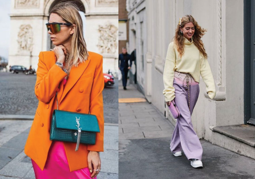
#10: Accessorize, Accessorize, Accessorize
This should be our new mantra. We might not realize it but accessories have so much power when you decide if an outfit deserves to be crowned or scrapped. They allow you to move the focus onto the bigger picture. They accentuate the seamless segues and enhance the gorgeous contrasts in an outfit, AND pull every piece together – giving meaning to their existence. Even if the prints clash, pair them up with accessories accordingly, and you’re the winner.
For example, picture plaids with gorgeous vintage shades, or florals with loud statement earrings. What about an animal print clutch to bridge the contrasting prints in your outfit? See, NEVER underestimate the power of accessories.
#11 Confidence Is KEY
You know what they say, it’s not what you wear it’s how you wear it. Fashion has no hard and fast rules and style is completely unique to each one of us. Confidence is the final, most important piece of the puzzle. It shows in your outfit, and this is the final key to boost your outfit from a naught to a nine. Embrace yourself and your outfit and you’ll turn heads like a supermodel on a runway.
While we do feel the most confident in our comfort zone, pushing out of it doesn’t have to be an uncomfortable experience. And now with this guide by you, it’s never been easier to do exactly that!
